Rebrand design
A refreshed identity direction built around familiarity, appetite and renewed everyday relevance.
Work / Mr Bigg's
We gave Nigeria's most nostalgic fast food brand a look that belongs to right now.
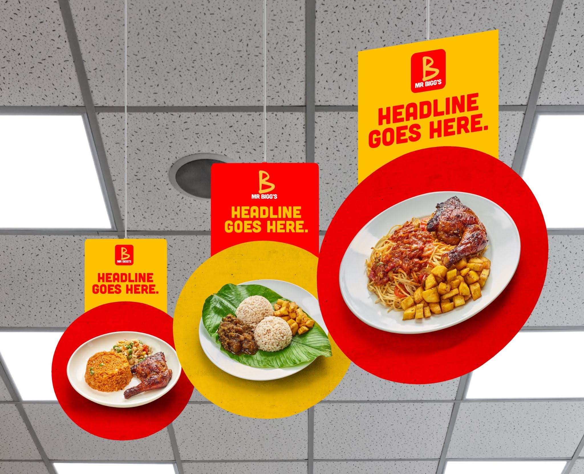
Mr Bigg's carried enormous affection, memory and cultural equity, but the brand needed a visual language that could feel fresh without losing what people loved about it.
We shaped a rebrand design system that respected the brand's place in Nigerian food culture while giving it clearer energy for stores, packaging, communications and everyday customer touchpoints.
A refreshed identity direction built around familiarity, appetite and renewed everyday relevance.
Visual behaviours designed to make the brand more consistent across retail, social and launch materials.
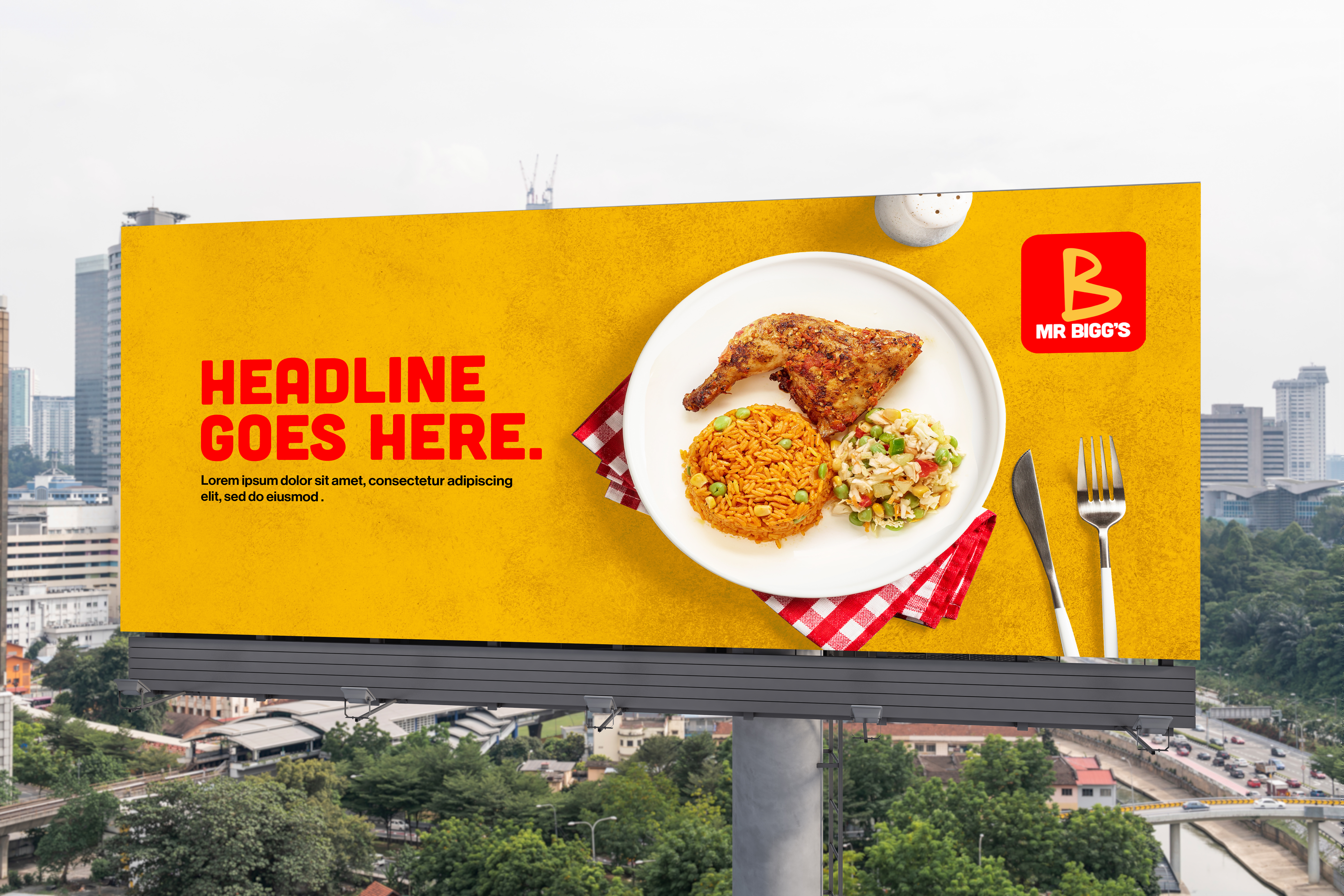
Design thinking that helps the rebrand show up clearly in-store, on packaging and in campaign assets.
A balance of nostalgia and now, keeping the emotional memory while making the brand feel current.
The Problem
The brand was familiar, but familiarity alone was not enough. It needed a more contemporary expression that could compete in a faster food and retail landscape.
The Insight
People did not need Mr Bigg's to become unrecognisable. They needed the brand to feel like the same memory, updated for the way they live and buy today.
The Idea
We created a design direction that made the brand brighter, sharper and easier to carry across the full experience.
Output
A rebrand system designed to help Mr Bigg's feel loved, current and ready for the next chapter.
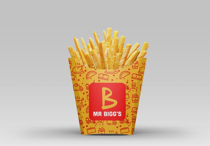
Identity, packaging, retail and communication assets shaped for a renewed fast food brand world.
Customer-facing applications designed across store, menu, packaging and campaign environments.
A nostalgic Nigerian food brand refreshed with enough familiarity to stay loved and enough clarity to feel current.
Work samples
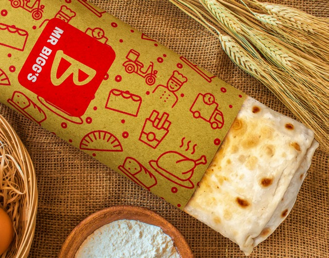
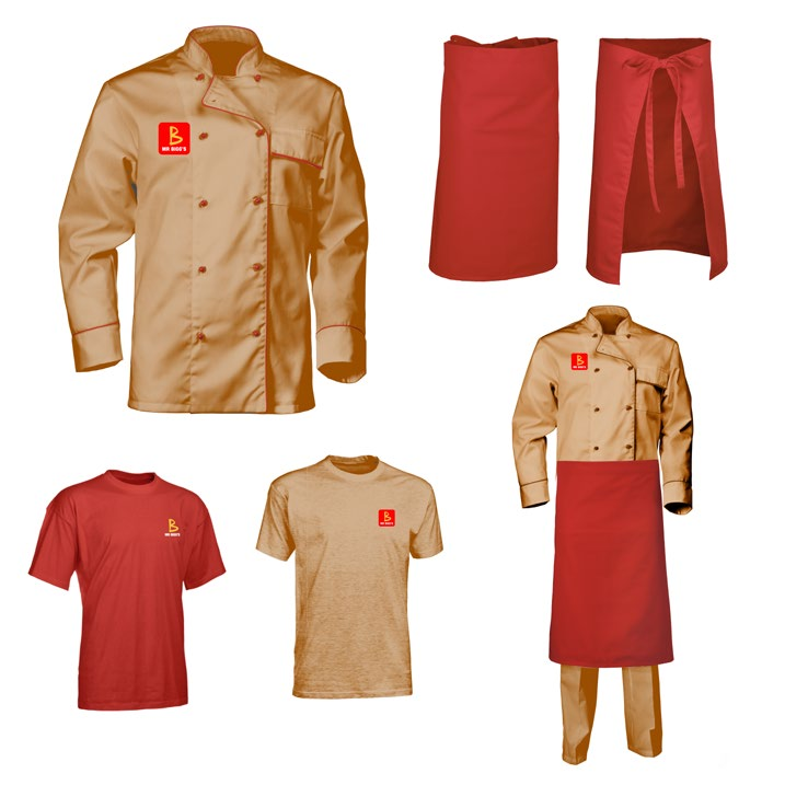
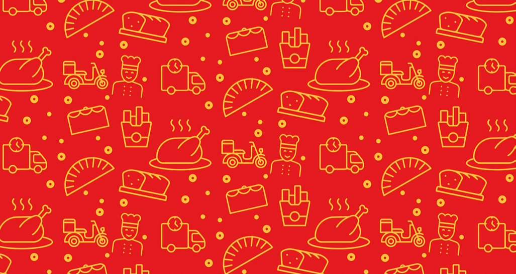
The rebrand in packaging, uniforms, office details and visual pattern applications.
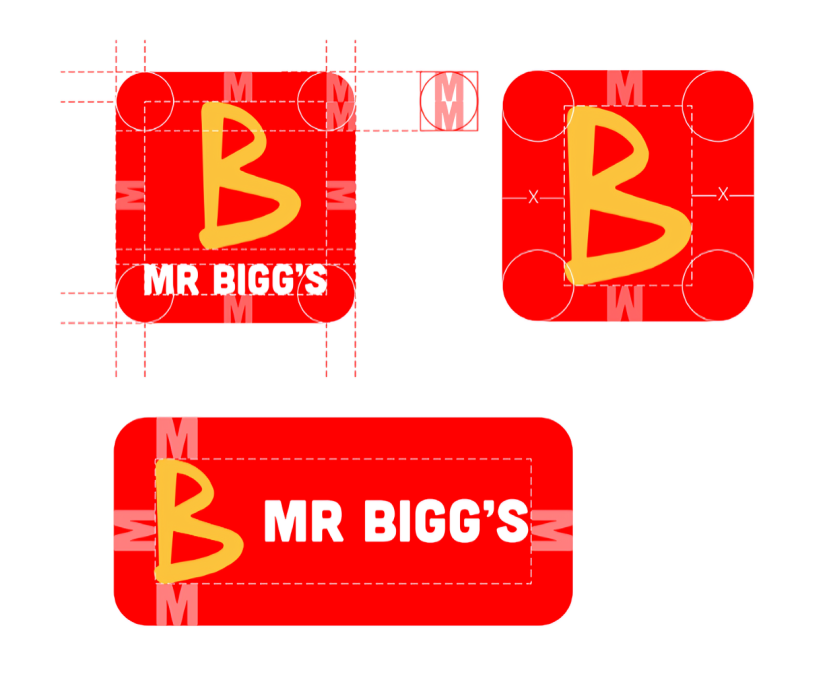
Connected experiences
More work from the studio.